If you’ve ever found yourself staring at a PowerPoint slide, wondering whether to call that colorful visual a chart or a graph, you are certainly not alone. It is one of those classic debates in the world of data visualization that often leaves students, business professionals, and even seasoned analysts scratching their heads. While many people use these terms interchangeably in casual conversation, they actually represent different ways of looking at information. Understanding the nuance isn’t just about being a “grammar geek”; it’s about choosing the right tool to tell your data’s story effectively.
The confusion stems from the fact that all graphs are technically a type of chart, but not all charts qualify as graphs. Although they look similar, they serve completely different purposes. While one is a broad umbrella term for any visual representation of data, the other is a specialized tool used to show mathematical relationships and trends over time. In this guide, we will break down the “chart vs graph” mystery so you can communicate your insights with absolute precision.
What Is a “Chart”?
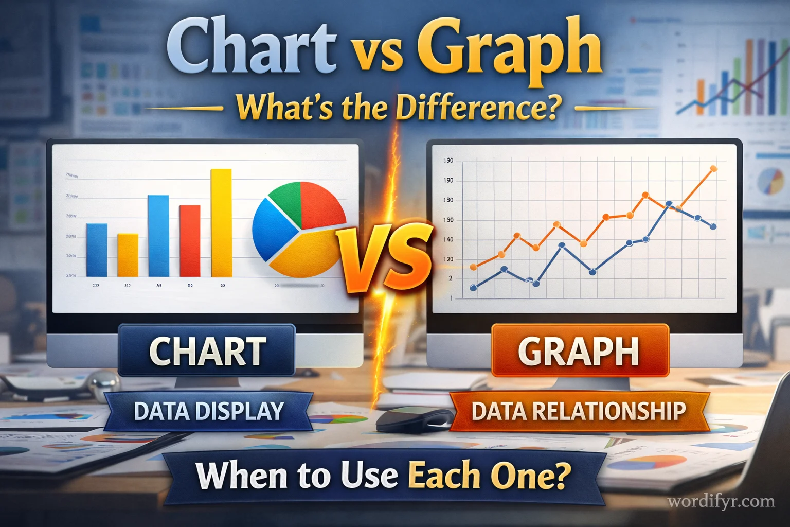
A chart is a high-level, broad term used to describe any graphical representation of data. Think of it as the “family name” for a wide variety of visual tools. The primary goal of a chart is to make information easy to understand at a glance. By using symbols like bars, slices, or icons, a chart transforms raw numbers into a story that the human brain can process much faster than a spreadsheet.
How It’s Used
Charts are used whenever you need to simplify complex datasets. They are perfect for comparing different categories, showing the parts of a whole, or mapping out a process. Because a chart can be anything from a simple table to a complex flow diagram, it is the go-to term in business meetings and general presentations.
Where It’s Used
You will find the term chart used globally in almost every industry. In a corporate office, you might see an “organizational chart” showing company hierarchy. In a hospital, a “patient chart” tracks medical history. Unlike some word pairs that vary by region (like “practice” vs “practise”), chart is a universal term in both American and British English.
Examples in Sentences
- “The marketing team created a chart to show our market share compared to competitors.”
- “Please refer to the organizational chart to see who reports to the CEO.”
- “We used a pie chart to illustrate how the budget was spent this quarter.”
A Note on Usage
Historically, the word chart comes from the Latin charta, meaning “paper” or “map.” This is why we still use the term “nautical chart” for maps used in navigation. It implies a structured layout of information on a surface.
What Is a “Graph”?
A graph is a more specific type of visual representation that focuses on the relationship between different variables. If a chart is the “family,” a graph is a specific “sibling” with a very technical job. Specifically, a graph almost always plots data points along an X-axis (horizontal) and a Y-axis (vertical) to show how one value changes in relation to another.
How It’s Used
Graphs are the workhorses of mathematics and science. They are used to show trends, patterns, and fluctuations over time. If you want to show how your company’s revenue has grown every month for the last five years, you would use a graph. It allows the viewer to see the “flow” of the data and predict future outcomes based on the slope of the line.
Where It’s Used
The word graph is most common in technical, scientific, and academic fields. While a business person might say “look at this chart,” a scientist or engineer is more likely to say “look at this graph” because they are interested in the mathematical function or the correlation between variables.
Examples in Sentences
- “The line graph clearly shows a spike in website traffic during the holiday season.”
- “We need to plot these coordinates on a graph to find the intersection point.”
- “The correlation graph suggests a strong link between temperature and ice cream sales.”
A Note on Usage
In the United States, the distinction is often blurred, and “chart” is frequently used for everything. However, in the UK and other Commonwealth countries, “graph” is strictly reserved for visuals with axes. The term “graph” is derived from the Greek graphein, meaning “to write,” emphasizing the “drawing” of a mathematical relationship.
Key Differences Between Chart and Graph
To master the chart vs graph distinction, it helps to see them side-by-side. Remember: every graph is a chart, but a chart isn’t always a graph.
Quick Comparison Points:
- Scope: A chart is a general category; a graph is a specific sub-type.
- Data Type: Charts often represent qualitative data (categories); graphs represent quantitative data (numbers/math).
- Axes: Graphs almost always have an X and Y axis; many charts (like pie charts) do not.
- Purpose: Charts summarize information; graphs show relationships and changes.
Comparison Table
| Feature | Chart | Graph |
| Definition | A broad visual representation of data. | A visual showing a relationship between variables. |
| Common Types | Pie charts, Flow charts, Gantt charts. | Line graphs, Scatter plots, Bar graphs. |
| Axes (X/Y) | Not always required. | Usually mandatory. |
| Primary Goal | To simplify and categorize info. | To show trends and mathematical changes. |
| Complexity | Usually simple and easy to read. | Can be complex and technical. |
| Example | “A map of the company’s structure.” | “A line showing stock price over time.” |
Real-Life Conversation Examples
Dialogue 1: The Presentation
A: “Should I put this data into a pie graph for the meeting?”
B: “Actually, it’s called a pie chart because it shows parts of a whole, not a trend over axes.”
A: “Got it. So, a chart is for categories, and a graph is for trends?”
B: “Exactly.”
🎯 Lesson: Use “chart” for visuals like pie slices that don’t use X and Y axes.
Dialogue 2: The Science Lab
A: “I’ve plotted the chemical reaction results on this chart.”
B: “Since you’re showing the relationship between time and temperature, we should call that a graph.”
A: “Right, because it has an X and Y axis.”
🎯 Lesson: Mathematical relationships between two variables are best described as a “graph.”
Dialogue 3: The Project Manager
A: “Is this Gantt thing a graph?”
B: “No, it’s a Gantt chart. It’s a schedule of tasks, not a mathematical function.”
A: “That makes sense. It’s a ‘map’ of our project.”
🎯 Lesson: Project schedules and process maps are always referred to as charts.
When to Use Chart vs Graph
Choosing the right word depends on what you are trying to communicate and who your audience is.
Use “Chart” when:
- You are showing proportions (like a pie chart).
- You are illustrating a process or hierarchy (like a flow chart).
- You are presenting to a general audience who needs a quick summary.
- The data is categorical (e.g., “Sales by Region”).
Use “Graph” when:
- You are showing trends over time (like a line graph).
- You are comparing two sets of numbers to see how they relate.
- You are writing for a technical or scientific audience.
- The data is continuous and plotted on axes.
Simple Memory Trick
Think of the letters:
- Chart = Categories (Groups and slices)
- Graph = Grid (X and Y lines)
Fun Facts & History
- The First Chart: William Playfair, a Scottish engineer, is credited with inventing the line, bar, and pie chart in the late 1700s. He wanted to make economic data easier for people to understand.
- Navigation Roots: Long before we had Excel, “charting” referred specifically to map-making. Sailors would “chart a course,” which is why we still call maps of the ocean “nautical charts.”
- The “Bar” Debate: A bar chart is often called a bar graph. Both are technically correct because bars represent categories (chart) but are also plotted on axes (graph). When in doubt, “chart” is the safer, broader term!
Conclusion
The distinction between chart vs graph might seem small, but using the right term adds a layer of professionalism to your work. In short, a chart is the broad umbrella that covers all visual data, while a graph is a specific tool used to plot mathematical relationships on a grid. If you are showing “how many,” reach for a chart. If you are showing “how it changed,” reach for a graph.
By keeping this simple rule in mind—Chart for Categories and Graph for Grids—you’ll never be confused again. Next time someone uses these two words, you’ll know exactly what they mean!


